Project Purpose
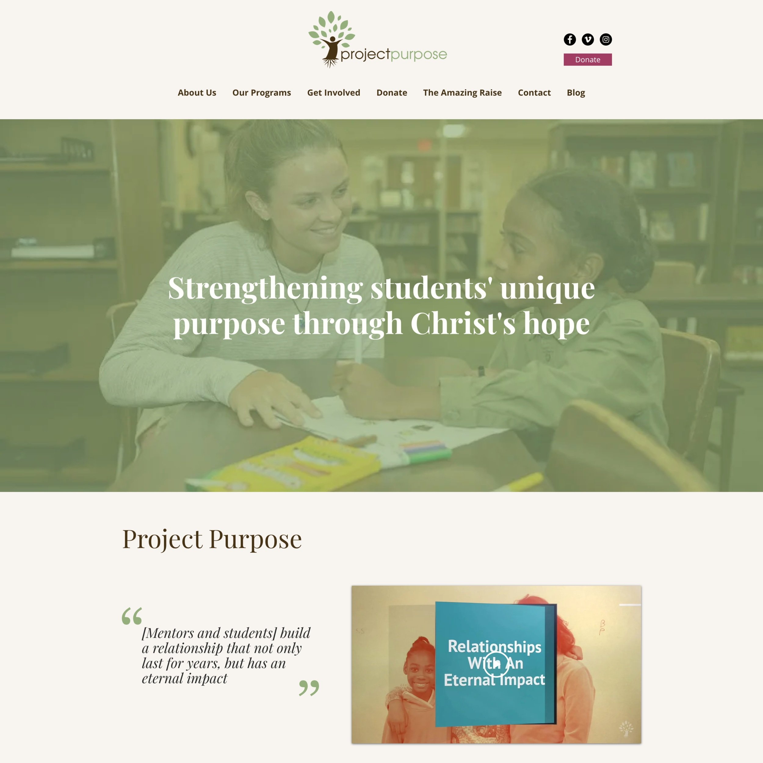
Project Purpose is a non-profit organization that helps youth in Pottstown, Philadelphia know they were created with a unique purpose through educational resources and mentoring relationships.
Product
Responsive Website
Role
UX/UI Researcher & Designer
Tools
Figma & Squarespace

Overview
Business Problem
Project Purpose’s Assistant Director wanted to accomplish:
Mobile friendliness
Clear understanding of Mission and Values
Fix certain UI aspects
Update offered programs
Users found website distracting; therefore, hard to continue using site
Users didn’t feel compelled to engage in the site
Users wanted less clicks to learn information
User Problem
How might we better showcase the foundation's impact, mission, and programs to increase fundraising and participation?
How might we create consistency in the branding throughout the site to make it inviting and easier to engage with?
The Challenge - How Might We….


Research
I conducted thorough competitor research to see how other foundations were presenting themselves and what compelling information stood out. After creating an affinity map from 20 user interviews, I found similar themes in motivations and needs when it came to the current Project Purpose site.
Competitor Analysis
With my users interviews, I was able to categorize the findings into 2 major themes. Additionally, the interviews confirmed that my stated problem and challenge is an issue that users are having and would like to be solved.
Affinity Mapping Major Themes

Define
I created my personas, defined my problem, and narrowed my solutions from the research and interviews conducted. I focused on what features I wanted to include and how best those could be execute.
User Persona
Using the information from my interviews and affinity mapping I created 2 different personas that would help drive the rest of my research and design
The Solution - Based on Research & Interviews
Fix accessibility, make it appealing to engage with, apply and keep with a consistent brand identity.
Visual Design
Eliminate pages (extra user interaction) and links that are not need or can be effectively combined elsewhere.
Simplify user information architecture
“One thing that I do not like about our website is how when you scroll down the page, the picture that is showcased moves. I personally feel like it causes too much for the brain to process.”
- Sara R., Assistant Director of Project Purpose

Design
Throughout my design phase, I created user and task flows, wireframes, and built off a brand identity.
With my persona, I focused on completing different tasks. Both flows focused on a motivation and pain point that I pinpoint earlier and would further solve my business and user problems.
User & Task Flows
I took my user and flow tasks using the low fidelity wireframes to design mid and high fidelity wire frames.
Wireframes
“Inviting, memorable, clean. Those are three words I would use to describe the site now.”
- Jack K., Interviewee

Usability Testing & Iterations
The prototype was sent to 20 participants to test 4 different tasks that met the solutions that would solve the problem at hand. From the prototype feedback, iterations were made and the final prototype was finalized.
Sign up for as a volunteer
Understanding of foundation's mission, vision, and values
Make a donation
Tasks to be measured:
Results
135% +
Home page views Month over Month
20%+
User Satisfation
9/10
Ease of Use score
1 = lowest, 10 = highest
100%
Task Completion
Removing extra links
Fonts for quotes
Name for quotes
Iterations
Removing extra links
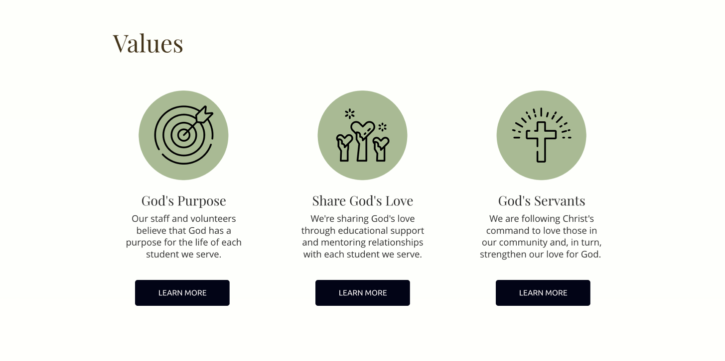
Each value was linked to a different page that would allow them to learn how the value was prioritized in the non-profit.
Before:
Users reported that this felt redundant and not necessary. They also didn’t feel likely to click them.
After:
2. Fonts for quotes
I was using the color green to tie in the branding, however users reported that the quote got lost in the background and was often overlooked.
Before:
After:
Using the darker brown branding color allowed the text to not be lost and increase accessibility.
3. Names on quotes
Not knowing who the quote was coming/where it was coming from didn’t add value to the quote.
Before:
By adding who the person was, it added more value to the quote.
After:

Brand Identity

Take Aways
I worked closely with Project Purpose’s Assistant Director throughout the design process and iteration phases. By doing so, I was able to clearly communicate changes based off user feedback, while still aligning with the business goals of the non-profit.
The passion Project Purpose’s Assistant Director had for Project Purpose was very admirable and I wanted to make sure that was conveyed in the design. I hoped to do this by aligning a brand identity, adding personal photos form Project Purposes activities, and quotes from parents and volunteers.
By completing thorough user research and emphasizing a user-centered design, I was able to provide a website that met the business and user problems to create an intuitive and meaningful website.


