Philly Peace in Progress
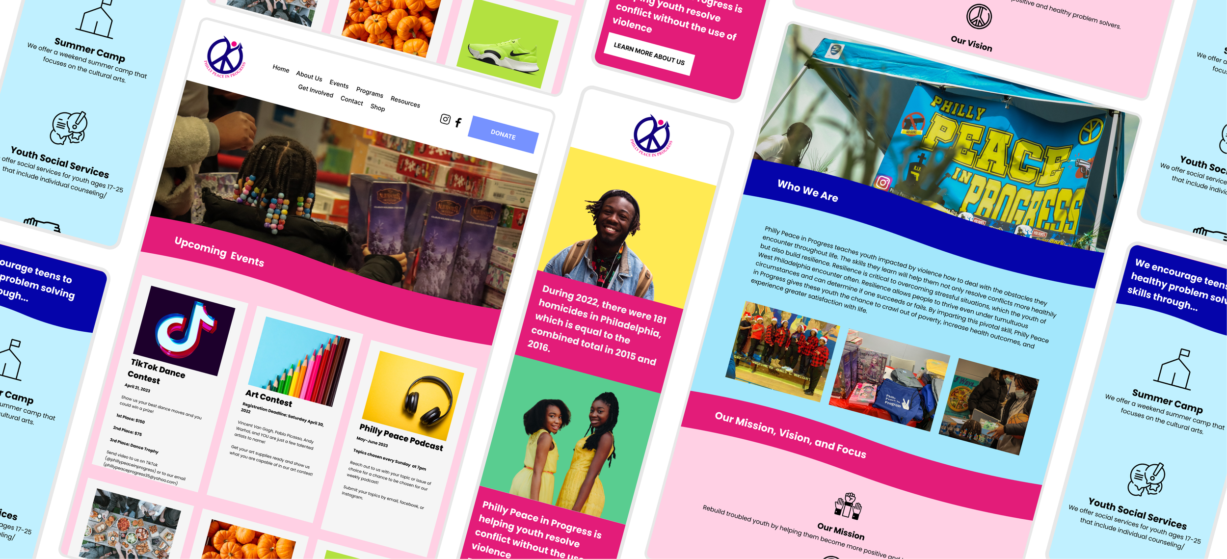
Philly Peace in Progress (PPIP) is a non-profit organization that helps youth in Philadelphia resolve conflict without the use of violence.
Product
Responsive Website
Role
UX/UI Researcher & Designer
Tools
Figma & Squarespace

Overview
The Philly Peace in Progress (PPIP) Founder and Executive Director had three major needs she wanted accomplished that weren't currently being met including participation in events, fundraising, and merchandise sells. wasn't meeting event participation goals, fundraising goals, and introduce merchandise sells to increase revenue.
Business Problem
Users don't have a clear understanding of the foundation
Users found text hard to read against certain images/colors (accessibility)
Users found event content to not be up to date
User Problem
How might we better showcase the foundation's impact, mission, and values to increase fundraising?
How might we update the events and programs to increase participation?
How might we increase accessibility of the site?
How might we increase ecommerce merchandise?
The Challenge - How Might We….


Research
I conducted thorough competitor research to see how other foundations were presenting themselves and what compelling information stood out. After creating an affinity map from user interviews, I found similar themes in motivations and needs when it came to the current Philly Peace in Progress site.
Interviews
8 Interviewees
Males and Females aged 26-61 years old
Employement
Varying in employment state
Philly Peace in Progress
Varying in involvement with the non-profit
Competitor Analysis
With my users interviews, I was able to categorize the findings into 3 major themes. Additionally, the interviews confirmed that my stated problem and challenge is an issue that users are having and would like to be solved.
Affinity Mapping Major Themes

Define
I created my personas, defined my problem, and narrowed my solutions from the research and interviews conducted. I focused on what features I wanted to include and how best those could be execute.
User Personas
Using the information from my interviews and affinity mapping I created 2 different personas that would help drive the rest of my research and design
The Solution - Based on Research & Interviews
Provide icons, images, and vibrant colors for users to build a connection with the foundation.
Visual Design
Interviews showed users like to see pictures from the foundation in order to establish a sense of connection. Additionally, pictures will give insight to the different events that have been held and also see how their donations have made a difference.
Showcase Events
Online Shopping Experience
Include e-commerce section in order to promote foundation and additional revenue.
Colors and text amongst certain colors, text size, and forms with text inside. color contrast, text size, and form issues.
Accessibility - Colors, Text, & Forms
"I'm lacking a "why" into the foundation. Like, 'Why should my child participate in an event? Why should I donate?’”
- Luke N. , Interviewee

Design
Throughout my design phase, I created user and task flows, wireframes, and built off a brand identity.
With my personas, I used Michael and Phyllis to focus on completing different tasks. Michael's task was to find and sign up his kids for an event. Phyllis' task was to make a donate to the foundation. Both flows focused on a motivation and pain point that I pinpoint earlier and would further solve my business and user problems.
User & Task Flows
I took my user and flow tasks using the low fidelity wireframes to design mid and high fidelity wire frames.
Wireframes
"The bright colors along with pictures from the events portrayed a foundation that seemed inviting and welcoming."
- Katie G., Interviewee

Usability Testing & Iterations
The prototype was sent to participants to test 4 different tasks that met the solutions that would solve the problem at hand. From the prototype feedback, iterations were made and the final prototype was finalized.
Sign up for an event
Make a donation
Understanding of foundation's mission, vision, and values
Buy merchandise
Tasks to be measured:
Results
75
Accessibility Score
8/10
Ease of Use score
1 = lowest, 10 = highest
25% +
Interest to Donate
100%
Task Completion
Clutter on home bar
“Who We Are”
Accessibility in forms
Iterations
Clutter on Home Bar
The home bar was too cluttered with the eight different options. User felts there were too many options that didn't necessarily need to be there.
Before:
By removing the "Contests" tab from the home bar and adding that section to the "events" tab, it allowed for a more aesthetically pleasing navigation bar. I felt "events" and "programs" could be together, but ultimately, the owner decided to keep them separate.
After:
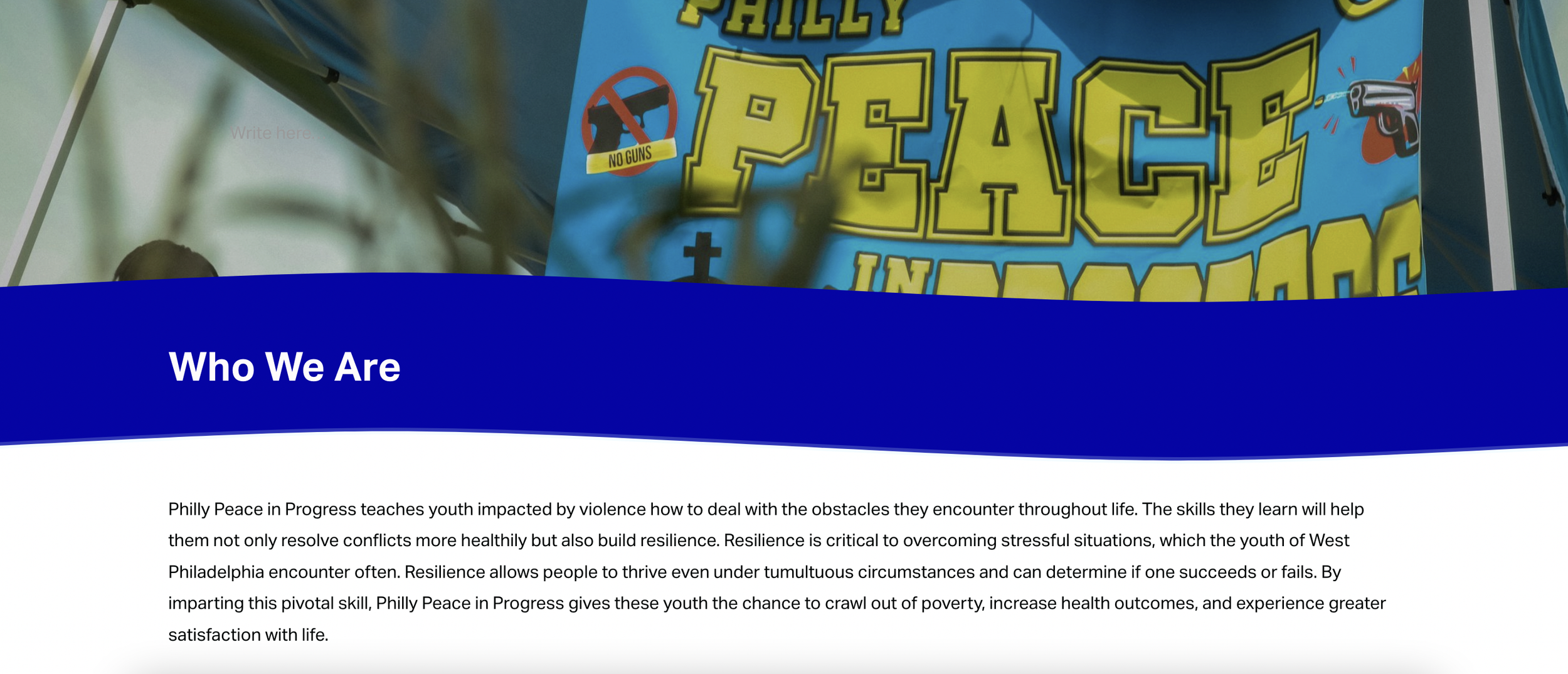
2. “Who We Are”
From the initial site, I fixed the wording to make statements more clear, but it was still unengaging to read and users reported that they skipped over it.
Before:
After:
I added visuals including a quote from the founder, icons, and pictures to attract users to read and stay engaged while reading.
3. Accessibility
White input fields failed WCAG AA/AAA. Additionally, lack of text in field does not increase accessibility.
Before:
Changed background to a darker yellow to increase contrast. Included text within input fields to meet accessibility needs.
After:
Final Prototype

Brand Identity

Take Aways
I worked closely with Philly Peace in Progress founder throughout the design process and iteration phases. By doing so, I was able to clearly communicate changes based off user feedback, while still aligning with her business goals.
Accessibility increased by 24 points through proper color and text contrast, providing alternative text for images, and adding text in input fields.
By completing thorough user research and emphasizing a user-centered design, I was able to provide a website that met the business and user problems to create an intuitive and meaningful website.
One challenge that I had was working with a brand identity that was already established and a website that needed to stay similar to the layout of the old design, which I found hard to make the site more modern.


