Kefi
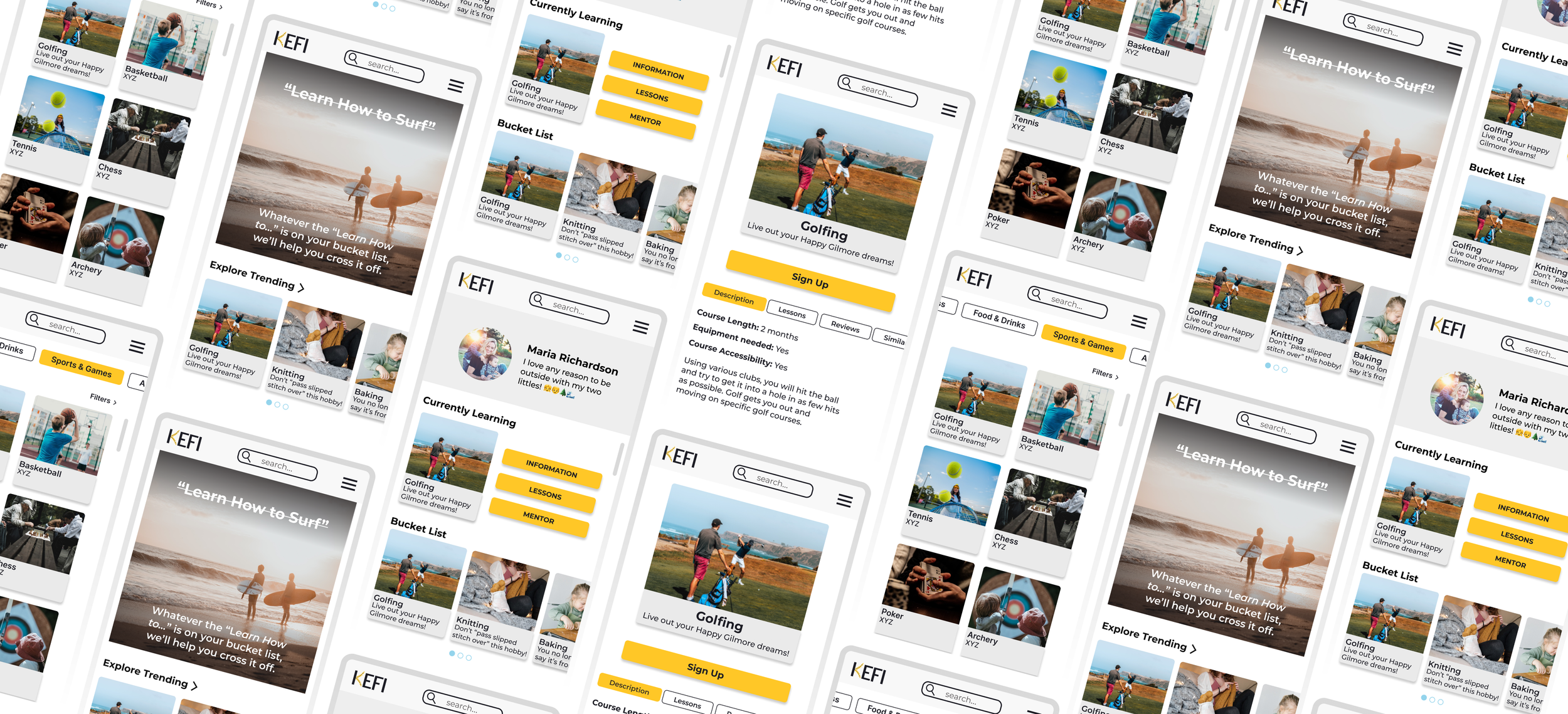
Kefi is an IOS mobile app that helps users easily find a new hobby or skill to learn that meets their needs.
Product
Mobile App
Role
UX/UI Researcher & Designer
Tools
Figma

Overview
There isn't an all in one platform that allows users to explore and help decrease feelings of frustrations when learning new skills and hobbies.
The Problem
How might we eliminate the feelings of frustration or discouragement while encouraging people to learn a new skill and hobby?
How might we encourage people to try learn a new skill or hobby?
The Challenge - How Might We….

Research
I conducted thorough competitor research to see how other foundations were presenting themselves and what compelling information stood out. After creating an affinity map from user interviews, I found similar themes in motivations and needs when it came to the current Philly Peace in Progress site.
Interviews
5 Interviewees
Males and Females aged 26-61 years old
Travel
Varying in travel experience
Competitor Analysis
With my users interviews, I was able to categorize the findings into 3 major themes. Additionally, the interviews confirmed that my stated problem and challenge is an issue that users are having and would like to be solved.
Affinity Mapping Major Themes

Define
I created my personas, defined my problem, and narrowed my solutions from the research and interviews conducted. I focused on what features I wanted to include and how best those could be execute.
User Personas
Using the information from my interviews and affinity mapping I created 2 different personas that would help drive the rest of my research and design
How might we eliminate the feelings of frustration or discouragement while learning a new skill or hobby?
Let’s circle back to our problem:
The Solution - Based on Research & Interviews
Having a mentor allows users to ask questions and receive feedback and reassurance from someone who is skilled in the hobby.
Mentor
Filters will help user find new hobbies that meet their needs (time, costs, group vs. solo, etc.)
Filter Options
“Now that I’m retired, I would love to learn a new hobby with my other friends who are recently retired, too! I think it would be so fun to do that together with my group of friends”
- Angela V.

Design
Throughout my design phase, I created user and task flows, wireframes, and built off a brand identity.
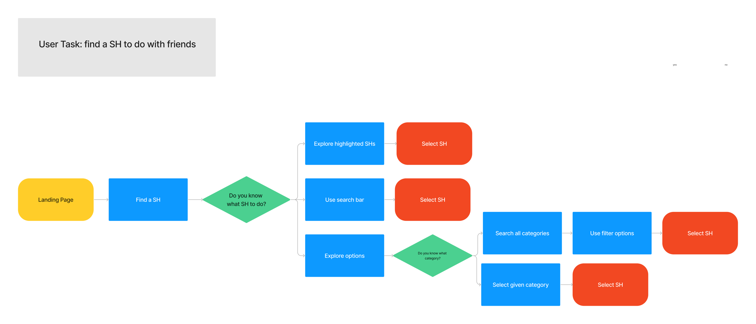
With my personas, I used Maria and Jimmy to focus on completing different tasks. Maria's user task was to connect with a mentor from the home page. Jimmy's user task was to find a skill or hobby to do with friends. Both flows focused on a motivation and pain point that I pinpoint earlier and would further solve my problem.
User & Task Flows
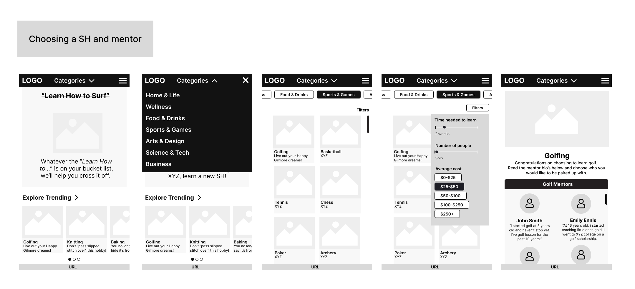
I took my user and flow tasks using the low fidelity wireframes to design mid and high fidelity wire frames.
Wireframes

Usability Testing & Iterations
The prototype was sent to participants to test 3 different tasks that met the solutions that would solve the problem at hand. From the prototype feedback, iterations were made and the final prototype was finalized.
Find a SH to do with a friend.
Connect with mentor to receive feedback on SH/lesson and decrease frustration
Choose a SH and mentor
Tasks to be measured:
Results
8
seconds
average time to connect with mentor
9/10
Ease of Use score
1 = lowest, 10 = highest
100%
Task Completion
Fix wording after signing up for hobby vs. for mentor
Fix text on “Go to Profile”
Clickable area for buttons
Added more blue branding and decreased font size
Iterations
Fix wording after signing up for hobby vs. for mentor
Users felt confusion after they signing up for a mentor after signing up for a hobby because the text said, "Congratulations! You are officially signed up for golfing!" Users felt they already signed up once they chose the hobby.
Before:
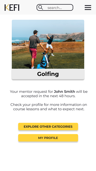
After the user signs up for golf and chooses their mentor, they see the message, "Your mentor request for John Smith will be accepted in the next 48 hours." This helped alleviate confusion about "singing up" and when you were officially signed up.
After:
2. Fix text on “Go to Profile”
After the users sign up for golfing and choose their mentor, they can "Explore Other Categories" or "Go to Profile". The "Go to Profile" button created confusion in the usability testing as they didn't know if it would take them to their own profile or to their mentor profile.
Before:
After:
The language of the text has changed to "My Profile" so it’s clear exactly where they are going. The color of the box has change to keep consistent with other clickable areas.
Final Prototype

Take Aways
With this project I was trying to make the quiz actually work with the Figma features, but I couldn't figure it out after searching and watching plenty of videos. That took up a lot of time and set me back on completing the project on time. Therefore, learning when to continue with an idea or just find the simpler route is a lesson I learned here.
I felt that the Away brand and website were sufficient and on brand. It was not something I felt needed to be reinvented and I wanted to focus on the quiz. However; this made me feel less organized with my Figma layers compared to other projects.
The quiz worked well as an added aspect and the way it was presented. There were plenty of ways to access the quiz without it popping up and disturbing a users flow on the site.


