Getaway
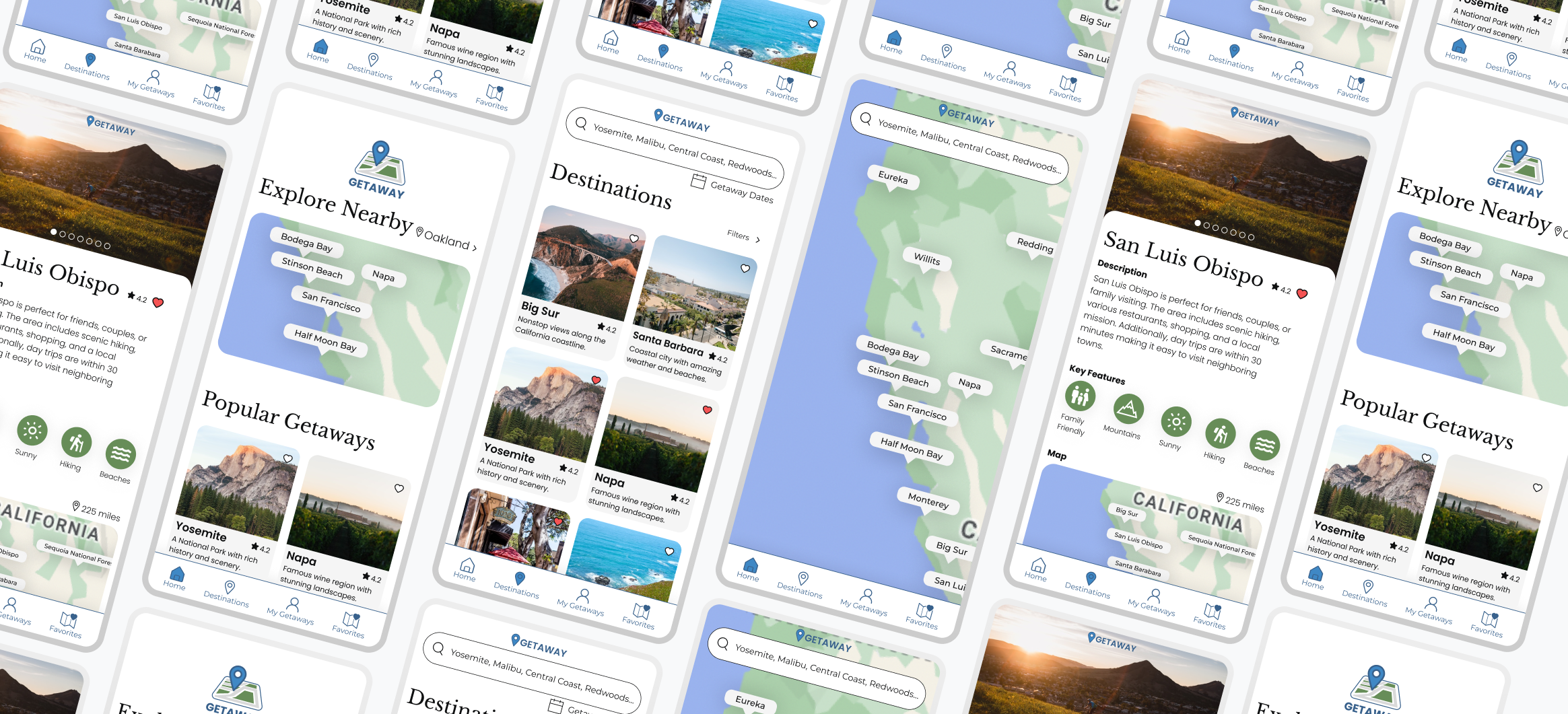
Getaway helps users explore and plan a weekend getaway. Various destinations along with key features, itineraries, and accommodations are included for users to easily plan and book their trip in one spot.
Product
Mobile App
Duration
September 2022
Role
UX/UI Researcher & Designer

Overview
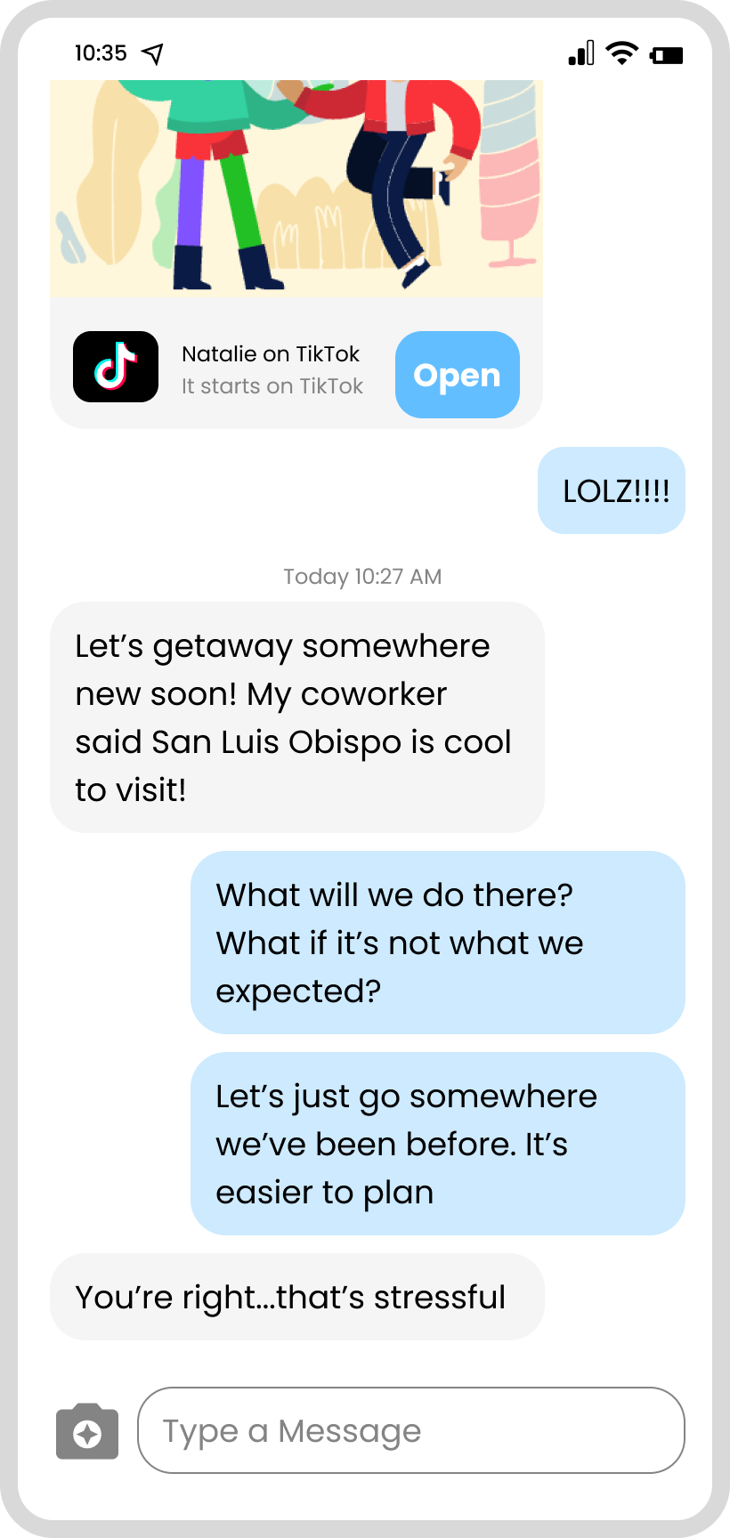
Planning a weekend away for many results in a battle between wanting to go somewhere new or going somewhere familiar because it's easier to plan. This app would help users ease the frustrations of planning a weekend away by easily exploring new destination nearby, providing itineraries, and booking accommodations in one spot.
The Problem
How might we encourage people to visit new places for a weekend getaway?
How might we ease the frustrations revolving around planning new trips?
How might we make users feel more comfortable in new places?
The Challenge - How Might We….

Research
I conducted thorough competitor research to see what services were being offer and utilized, while also seeing how my problem isn't currently being supported with competitors. After creating an affinity map from user interviews, I found similar themes in motivations, pain points, and trip planning process.
Competitors
Unique housing (castle, lakefront, etc.)
Map to explore and see houses in the area you are searching
Plenty of pictures
Airbnb
Focuses on Europe
Gives you country, places to visit, country map, plan, photos, videos, etc.
Rick Steves’ Europe
Need to know a destination to search or search "near me"
Often just a quick blurb about the place
Blogs link to hotels, attractions, etc.
Little blurb about attractions within the itinerary, lots of pictures in influencer style
Search Engines
Interview
Planning Process: Users ask others for new trip recommendations
Motivation: Will go somewhere familiar because it's easier to plan
Pain Point: New destinations cause stress of the unknowns
Planning Process: Usually trip is 3 days long and 3-5 hour drive max
Motivation: Users have a purpose for their trip
Planning Process: Choose a destination, book accommodation, then activities
Affinity Mapping Major Themes
With my 5 users interviews, I was able to categorize the findings into 8 major themes. Additionally, the interviews confirmed that my stated problem and challenge is an issue that users are having and would like to be solved.

Define
I created my personas, defined my problem, and narrowed my solutions from the research and interviews conducted. I focused on what features I wanted to include and how best those could be execute.
Using the information from my interviews and affinity mapping I created 2 different personas that would help drive the rest of my research and design.
User Personas
Let’s Circle Back to our Problem!
How might we encourage people to visit new places for a weekend getaway?
Solutions to be Used - Based on Research and Interviews
User never has to leave the app! Choosing a location, picking and editing an itinerary, and booking an accommodation will be completed in the app.
All-in-One Booking System
Interviews showed users are willing to travel 3-5 hours from home. Map will show users places that are close to them, haven't heard of, or didn't think for a weekend getaway
Nearby Destinations Map
After picking a destination, interviews showed that users book their accommodation next. Recommendations for stays allow for easy all-in-one booking access.
Accommodation Booking
Users expressed frustration in the unknown of new places. Providing a suggested itinerary allows users with a recommended list of activities, restaurants, and more to make the most of their trip.
Itinerary Planning
"I'm adventurous, but I do not like making mistakes. I wouldn't go somewhere without trusted sources."
- Keith R., Interviewee

Design
Throughout my design phase, I created user and task flows, wireframes, and a brand identity.
With my personas, I used Amy and Keith to focus on completing different tasks. Amy's task was to find a new destination to explore then book the accommodation and activities. Keith's task was to explore the itinerary for a new destination. Both flows focused on a motivation and pain point that I pinpoint earlier and would further solve my problem.
User & Task Flows
I took my user and flow tasks using the low fidelity wireframes to design mid and high fidelity wireframes.
Included in my low fidelity wireframes are the key features that I want users to navigate through when completing a task. These include profile, map, itinerary, destinations, and accommodations. In the mid and high fidelity wireframes I start to fine tune these key features and how I want the brand to be represented.
Wireframes
"I feel like there are so many places around me, but I just don't know enough about them, so I never visit them. I feel like this app with the map feature could help me decide on new places to visit!"
- Katie G., Interviewee

Usability Testing & Iterations
The prototype was sent to 30 participants to test 4 different tasks that met the solutions that would solve the problem at hand. From the prototype feedback, iterations were made and the final prototype was finalized.
Explore a nearby location
Learn about a destination
Access and explore a destination's itinerary
Review itinerary and accommodation after adding destination to "My Getaway"
Tasks to be measured:
I used the Google HEART framework as a guide to measure my tasks and the impact it had with users.
Results
83%
NPS Satisfaction
9/10
Ease of Use score
1 = lowest, 10 = highest
30% +
Likeliness to visit a new destination
100%
Task Completion
Navigation bar is cluttered.
Search bar on home, destinations, and favorites.
Clearer distinction between looking at a destination and actually planning a destination.
Consistency with action color of blue.
Confusion on "Plan your Getaway" - how does it go from "Plan" to "Upcoming"?
Iterations
Navigation bar is cluttered
The home bar was too cluttered with the eight different options. User felts there were too many options that didn't necessarily need to be there.
Before:
By removing the "Contests" tab from the home bar and adding that section to the "events" tab, it allowed for a more aesthetically pleasing navigation bar. I felt "events" and "programs" could be together, but ultimately, the owner decided to keep them separate.
After:
2. Purposefully Placing Search Bar
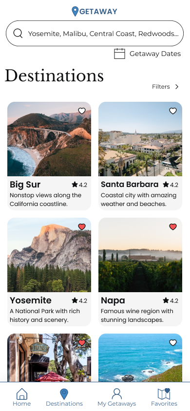
Search bar was available anywhere destinations were showing - home, destinations, and favorites tab.
Before:
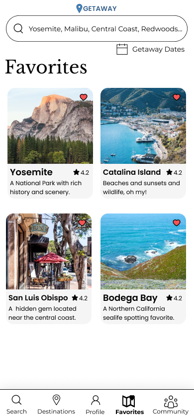
The search bar is only available on the destination tab. Home is more about exploring destinations. Destinations is about searching for destinations. Favorites is about places the user has favorited and shown interest in.
After:
3. Clarifying looking at destination VS. planning destination
Before:
There wasn't clear distinction between just looking at a destination and wanting to start planning that destination. A button was added, but I wasn't sure what it should say to indicate that the user is going to start planning a getaway rather than just looking at the getaway.
A few iterations were made:
Button "Add to 'Plan your Getaway'" which is in the user's profile.
Added an "Upcoming Getaway" section in addition to the "Plan your Getaway" to show a distinction between the two.
Once it's added to "Plan your Getaway" the wording and pages have changed for Description, Edit Itinerary, and Book Accommodation.
After:
4. Options for turning getaways from "Plan Your Getaway" to "Upcoming Getaway"
I have not solved this problem yet. There is slight confusion as to when the "Plan your Getaway" becomes an "Upcoming Getaway". I felt it was good as a MVP, but should be fixed in the future.
Currently:
Future Iterations Options:
A button added to the description page saying, "Move to 'Upcoming Getaway'".
Options for editing and finalizing itinerary. Once finalized it automatically moves to "Upcoming Getaway".
Once accommodation is booked, the user is notified that their trip has been moved to "Upcoming Getaway" since booking an accommodation usually means the trip is happening.
Once the itinerary and accommodation have been finalized, then it automatically moves to "Upcoming Getaway".
Final Prototype

Brand Identity
Name: Getaway is modeled after it's multiple meanings; a place that is suitable for vacation, especially for a brief duration.
Brand Values:
Inspiring
inspire others to experience travel for a weekend getaway, especially to new places.
Inviting
traveling can be intimidating so we want to invite others to feel comfortable throughout their getaway process.
Exploration
encourage users to explore new places and try new things.
Experience
allow users to create experiences and memories for whatever their getaway purpose is. Additionally, we want experienced employees to create content that is well researched and experienced by them, too.
Passion
the users, company, and employees have a passion ignited within them to want to travel.
Honesty
for the company to be open and transparent about destinations and itineraries. Content should be included with experience and honesty, not because of a promotion.
Colors: Blue adds a sense of calmness since sometimes traveling and planning can be frustrating. Additionally, it represents freedom, possibilities, and openness. The logo includes green as that is often represented with maps and nature, both a big part of travel.
UI Design: The design is simple and straightforward in order for the user to focus on the task they want to complete. There is no reason for them to have to click through multiple pages or not know where to go while searching destinations or editing itineraries for their trips. Additionally, there are plenty of pictures showing the destination or accommodation as people seek and respond well to accurate pictures.

Take Aways
The prototype was a success as it was driven by research, interviews, and users. 90% of users believed product was straightforward and effective. Improved discoverability through location favorability to increase recurring visits/booking and reduced pain points.
Continually have people testing and giving feedback on the project
2 different users did continual testing and feedback and as a result I was able to locate and fix problems before I sent off the prototype is more testers. I was first able to realize there is no way to actually turn a destination you're looking at into your profile with the "Plan your Getaway". That's when I decided there needed to be a button, but wasn't sure what it need to say or which action it would produce.
I had to really think through what needed to be include or not and how that would translate with the user.
Thinking about the logistics of planning a destination vs. going seemed to be the hardest for me because I couldn't figure out a way to do it that seemed natural and didn't require more steps than needed.
I looked up other designs/apps and used others for feedback on ideas in order to arrive at the product that I have now.


