Europa
Europa is a family-owned restaurant in Orinda, CA.
Product
Website
Role
UX/UI Researcher & Designer
Tools
Figma

Overview
The outdated website is not responsive as it does not adapt for mobile sites.
The menu is overwhelming and just lists everything, same with the catering - not easy to read.
No pictures of the food or restaurant and instead just stock images of random chef.
The Problem
How might we create a responsive website that allows users to explore the restaurants services?
How might we better showcase what the restaurant serves?
How might we convey the ambiance of the restaurant?
How might we make it easier for the owners to use and update items?
The Challenge - How Might We….


Research
I conducted thorough competitor research to see what services were being offer and utilized, while also seeing how my problem isn't currently being supported with competitors. After creating an affinity map from user interviews, I found similar themes in motivations and pain points.
Direct Competitors (located in Orinda)
Website is adaptive
Menu is easy to understand and follow
Contact form for fundraisers
Nations
Map for directions
Menu is PDF pictures
Website is not up to date and very hard to follow
Shelby's
Secondary Competitors (Hafbraus)
Video on landing page of assembling a sandwich
Menu broken into categories, easy to follow
Has opening hours, but no location for restaurant
Hafbrau Morro Bay
Menu is broken into days and further into lunch and dinner
Emojis in food description, but not consistent
Events/What's Going On with link to FB page.
Harry’s Hofbrau
Interview with the owner and 3 males and 2 female interviewees - USA residents, aged 28-62 years old, varying in employment status. These were completed in person and remote while I recorded and transcribed the interview.
Interview
With my 5 users interviews, I was able to categorize the findings into 5 major themes, but 3 stood out the most. Additionally, it showed the owner’s pain points transfer into functionality and visuals of the sites.
Affinity Mapping Major Themes

Define
I created my personas, defined my problem, and narrowed my solutions from the research and interviews conducted. I focused on what features I wanted to include and used feedback from the owner in order to prioritize those features.
Using the information from my interviews and affinity mapping I created 2 different personas that would help drive the rest of my research and design.
User Personas
How might we create a responsive website that allows users to explore the restaurants services and understand what the restaurant is.
Let’s Circle Back to our Problem!
Solutions to be Used - Based on Research and Interviews
This will allows users to properly use the site on their mobile
Responsive Website
Showcase different services and events
Users can see what the restaurant offers (caterings, space for parties, daily specials, holiday specials).
"I’m usually using my phone to look up places to eat and see what is on their menu ahead of time."
- Katie G., Interviewee

Design
Throughout my design phase, I created user and task flows, wireframes, and a brand identity.
With my personas, I used Chris and Michelle to focus on completing different tasks. Chris' user task was to inquire about renting out the private space in Europa. Michelle's user task was to look up the menu, see that it fits her needs, and find directions to Europa. Both flows focused on a motivation and pain point that I pinpoint earlier and would further solve my problem.
User & Task Flows
I took my user and flow tasks and designed low, mid, and high fidelity wire frames.
Included in my mid fidelity wireframes are the key features that I want users to navigate through when completing a task. These include home page, weekly specials, directions, menu, and space inquiry. In the high fidelity wireframes I start to fine tune these key features and how I want the brand to be represented.
After the mid fidelity wireframes, I asked the owners if there is anything they felt need to be included with their website. The owner wanted to change the inquiry form to just the phone number as she is less likely to check her email. So that was changed for the high fidelity wireframes.
Wireframes

Usability Testing & Iterations
The prototype was sent to 15 participants to test 3 different tasks that met the solutions that would solve the problem at hand. From the prototype feedback, iterations were made and the final prototype was finalized.
Access the menu
Book an event
Understand gist of restaurant
Tasks to be measured:
Results
4/5
Understanding of restaurant
8/10
Ease of Use score
1 = lowest, 10 = highest
100%
Task Completion
Menu bar with all the options to click on
More restaurant character
Iterations
Menu bar
On the menu page, you have to scroll through all the options to understand what they provide. Users wanted a bar that shows all the categories of food that can be clicked on to jump to where they want to look specifically.
Before:
I provided a menu bar at the top that would allow users to see all the categories provided. They can click on one and it will scroll down to the part of the menu.
After:
2. Restaurant Character
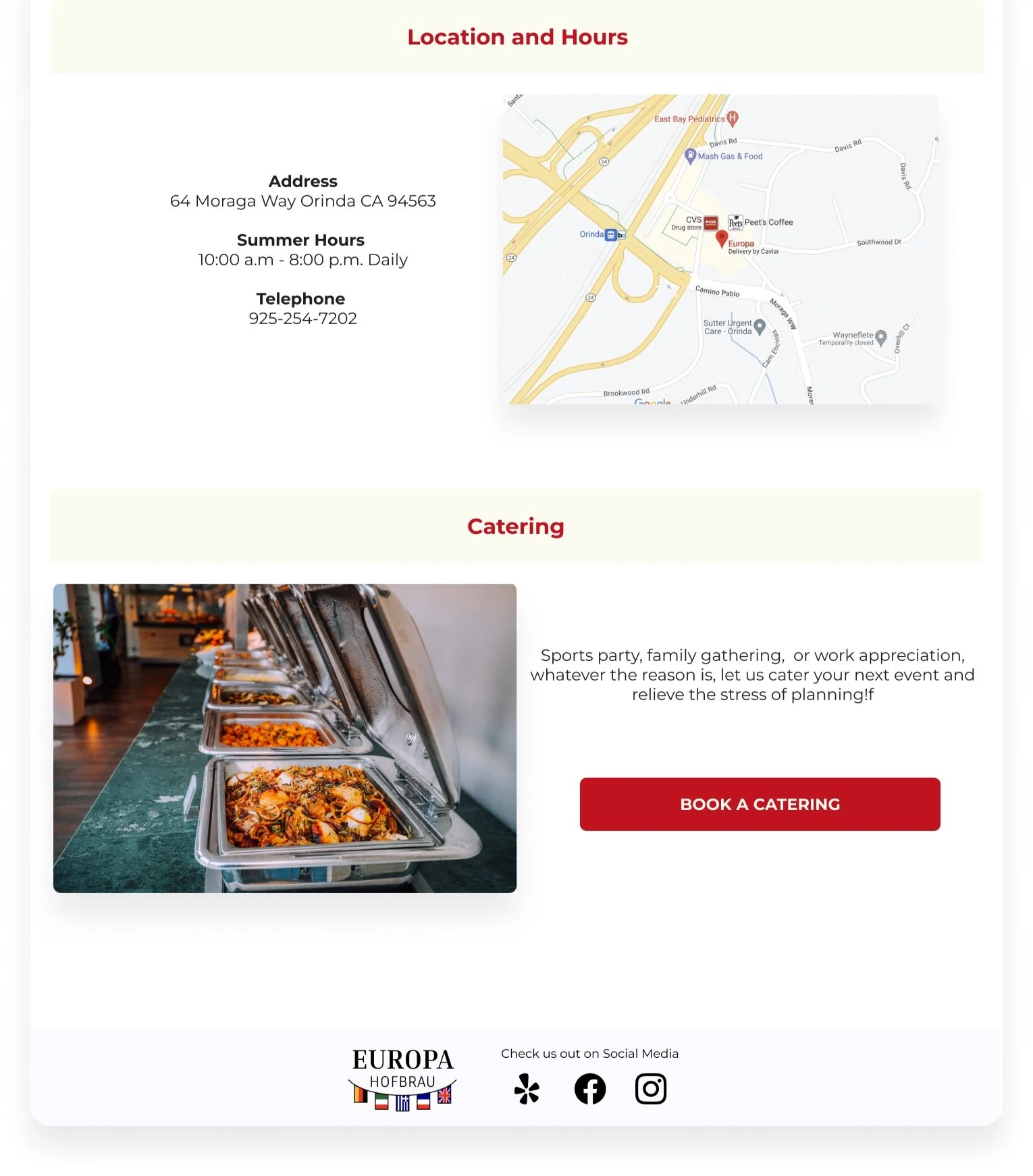
Users felt a little bit more character could be added to the site to connect with the restaurant more.
Before:
I added the flags from the new logo under the main heading titles on each page. Additionally, a simplified logo without the columns at the bottom to tie in the restaurant again.
After:
Final Prototype

Brand Identity
I wanted to give Europa's design a little bit of a refresh. Additionally, I wanted it to have a part of it that could be used on it's own as a logo and still be identifiable.
Must Haves for the new logo:
1. Europa Hafbrau
2. The 5 different European flags
3. Greek Column
Final Logo:

Take Aways
Working with “stakeholders” aka the owners was interesting because sometimes I didn't agree with the things they wanted, example the main logo, they had to have the flags and columns
It seemed more straightforward with finding problems and solutions as their website overall needed to be revamped and modernized. They don’t do reservations or doordash so nothing like that had to be included or considered. They also like to be called instead of emailed for inquiries.
Adding more “character” is what I need to work on. I think it lacks some character but i didn't want to over complicate it either.


