Edtomorrow
EdTomorrow is an education company that offers Restorative Practices for schools and districts to optimize learning experiences and outcomes for educators and students.
Product
Responsive Homepage
Role
UX/UI Researcher & Designer
Tools
Figma & Squarespace

Overview
Business Problem
Edtomorrow wanted to accomplish:
Advertise Professional Development (PD) program clearer
Increase inquiry/sales of PD
Users are unaware that Edtomorrow offers PD
Users are confused what the PD entails
User Problem
How might we better showcase Edtomorrow’s PD program to new and reoccurring users visiting the site?
How might we simply explain what the PD is to further user engagement?
How might we need to market the PD to increase user inquiry?
The Challenge - How Might We….


Research
I conducted thorough competitor research to see how other Education companies and Professional Development programs were presenting themselves and what compelling information stood out. After creating an affinity map from 5 user interviews, I found similar themes in motivations and needs when it came to the current Edtomorrow landing page.
Interviews
5 Interviewees
Male and Female; 27-62 years old
Employment
Principals and Vice Principals
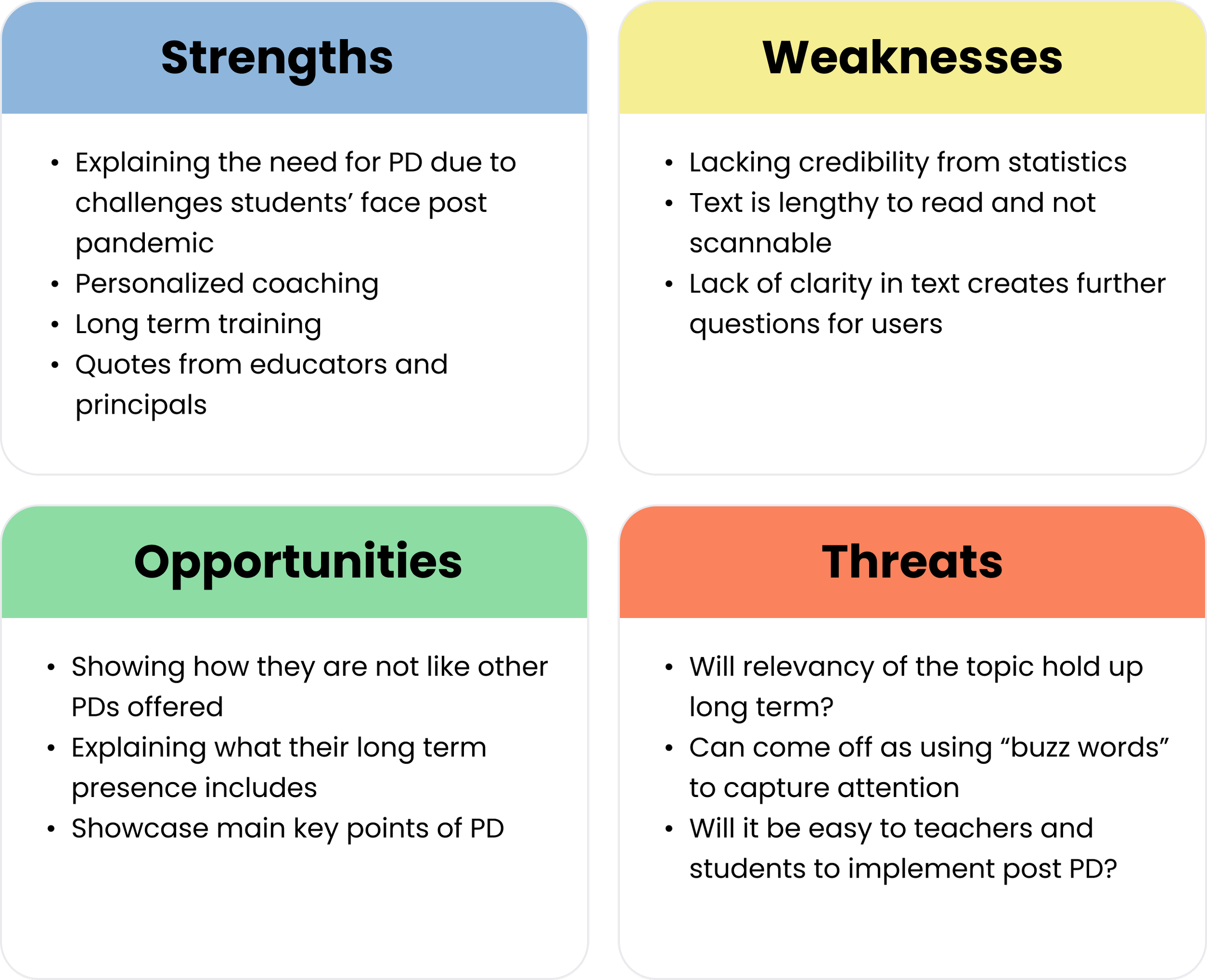
Competitor Analysis - SWOT
With my users interviews, I was able to categorize the findings into 3 major themes. Additionally, the interviews confirmed that my stated problem and challenge is an issue that users are having and would like to be solved.
Affinity Mapping Major Themes
Style
Asynchronous Form, ~5 minutes, quick turn-around

Define
I created my personas, defined my problem, and narrowed my solutions from the research and interviews conducted. I focused on what features I wanted to include and how best those could be execute.
User Persona
Using the information from my interviews and affinity mapping I created a persona that would help drive the rest of my research and design.
The Solution - Based on Research & Interviews
Allow users to know what program they are learning about right away and interact further if desired
CTA
Design a simple layout with graphics that focuses on answering user’s main concerns in a captivating way
Answer Users’ Questions
Increase text’s readability, clarity, and effectiviness in conveying the offered Professional Development program
Improve Text
Include relevant quotes, powerful statistics, and geographical map to build trust and validate expertise of Edtomorrow
Enchance Credibility
“ This company recognizes that students need more social emotional support and skills after Covid, and this company gives PD to support teachers admins etc.”
- Theo P., Elementary School Principal

Design
Throughout my design phase, I created wireframes and built off a brand identity provided by Edtomorrow.
I took my user and flow tasks using the low fidelity wireframes to design mid and high fidelity wire frames.
Wireframes
Edtomorrow offers The First Five which is a daily resource for teachers to use with students and widely successful. Many educators log onto their site daily to access The First Five; therefore, my clients decide they wanted to promote The First Five towards the top in tandem with their PD program.
Revisit Business Goals
Mid Fidelity Design Revisions
Using UI inspiration from “Two Men and a Truck” per Edtomorrow’s request
Client no longer wanted “hand drawn” type icons
Wanted to include virtual events
Used light green from color palette to create brand consistency, but also incorporated new colors the client wanted to use
Added brand colors of blue and green throughout design to align with Edtomorrow’s brand
“First five and restorative practices are the main fields of expertise. The explanation of these two need to be explained prior to the next segment which would focus on PD opportunities for both of these. I like seeing the statistics and feedback quotes.”
- Angela V., Educator

Usability Testing & Iterations
The prototype was sent to 20 educators to test 2 different tasks that met the solutions that would solve the problem at hand. Teachers were included in the testing as teachers use the site to access First Five. From the prototype feedback, iterations were made and the final prototype was finalized.
Learn about Professional Development program
Inquiry more about PD program
Tasks to be measured:
Results
135% +
Increase in PD understanding
20%+
User Satisfation
100%
Task Completion
Increase transparency with PD text
Brand consistency
Iterations Made Throughout
Increase transparency
Users expressed keys things to know: how long PD is, the cost, who leads it, and is it on site.
Before:
This section answered key questions and elaborated on them: who leads the sessions, is it on site, and post PD support.
After:
2. Brand Consistency
Primarily due to a glitch within Squarespace, the buttons would not update to stay consistent with the rest of the site with the new colors added to the palette.
Before:
After:
The buttons should be in an oval box and not be underlined in order to show it’s clickable.
30%
Users Still Having Unanswered Questions

Brand Identity

Take Aways
It’s natural for users to always have unanswered questions, but where is the line between having too many or big enough questions to deter users away from interacting more with the site/company? Users expressed that they wanted to know the cost, however, Edtomorrow requires users to contact them to learn more in order to learn about pricing.
Edtomorrow loved the UI of Two Men and a Truck and wanted to incorporate UI aspects of it into their homepage; however, I think some of the choices did not flow into the UI they have established as a brand.
User research and explaining reasoning for UI and UX choices allowed me to show Edtomorrow why I was making the decisions I made in my designs. UI choices like incorporating blue and bright green into the backgrounds and accent colors, along with answering questions users had in the “Why Edtomorrow” had more validity.


