Away
A responsive website for Away designs, a travel luggage and accessories company for modern travel.
Product
Responsive Website
Role
UX/UI Researcher & Designer
Tools
Figma

Overview
Away offers similar luggage options for a user to choose between; therefore, the user has to do research off site or click on all the luggage to find the one that best fits their travel needs.
The Problem
How might we incorporate a quiz to help users learn more about features of the luggage that best fits their needs?
How might we decrease confusion when choosing new luggage?
How might we ease frustrations when buying new luggage?
How might we make online shopping for luggage easier?
The Challenge - How Might We….


Research
I conducted thorough competitor research to see how other foundations were presenting themselves and what compelling information stood out. After creating an affinity map from user interviews, I found similar themes in motivations and needs when it came to the current Philly Peace in Progress site.
Interviews
5 Interviewees
Males and Females aged 26-61 years old
Travel
Varying in travel experience
Competitor Analysis
With my users interviews, I was able to categorize the findings into 3 major themes. Additionally, the interviews confirmed that my stated problem and challenge is an issue that users are having and would like to be solved.
Affinity Mapping Major Themes

Define
I created my personas, defined my problem, and narrowed my solutions from the research and interviews conducted. I focused on what features I wanted to include and how best those could be execute.
User Personas
Using the information from my interviews and affinity mapping I created 2 different personas that would help drive the rest of my research and design
How might we incorporate a quiz to help users learn more about features of the luggage that best fits their needs in order to make online luggage shopping less frustrating, confusing, and easier for the consumer.
Let’s circle back to our problem:
The Solution - Based on Research & Interviews
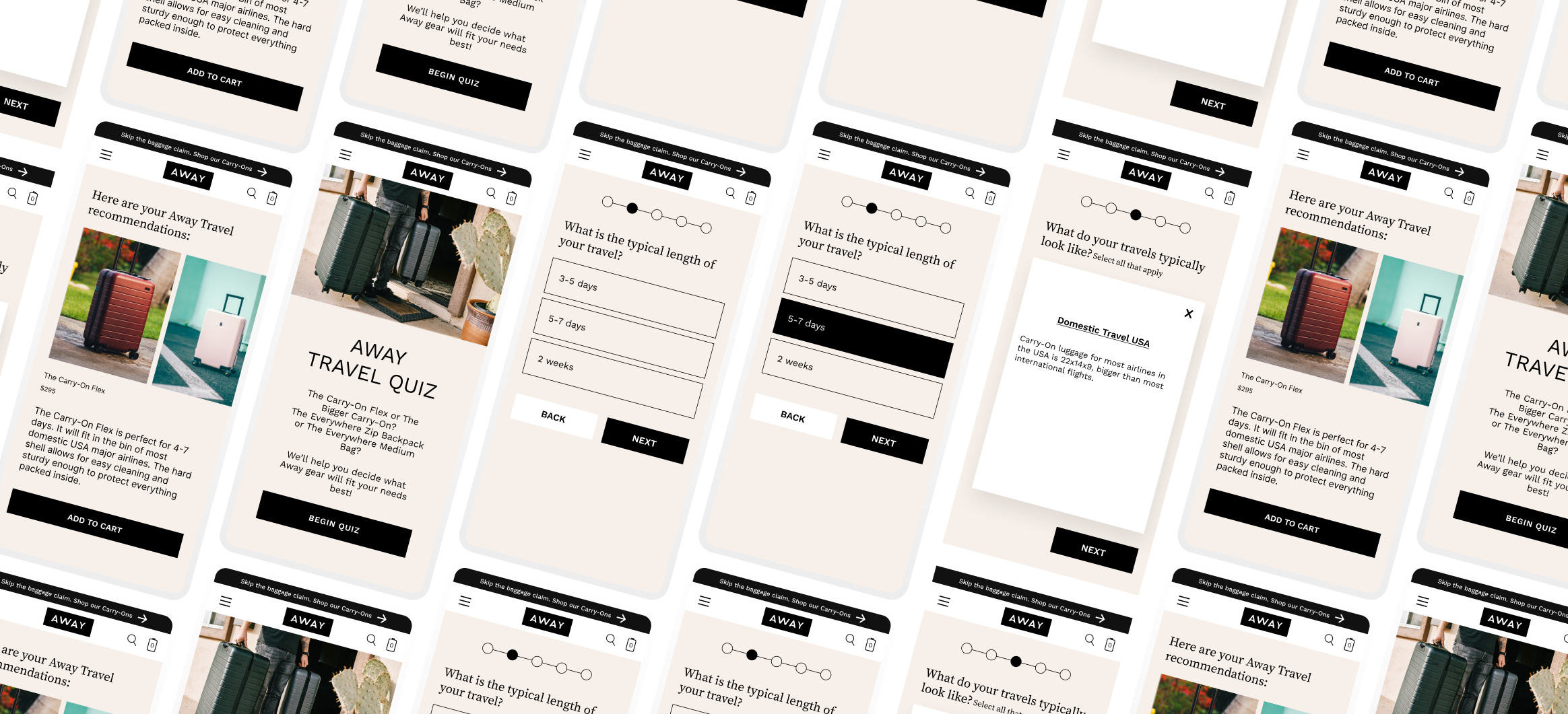
An adaptable quiz that helps users decide which Away luggage would fit their needs best. Results are tailored towards the user’s wants and needs.
Luggage Quiz
“I bought a duffle as an overnight bag…I hate it because it’s too big for what I wanted and it lacked structure. At least the design was cute, though!
- Emily R., Interviewee

Design
Throughout my design phase, I created user and task flows, wireframes, and built off a brand identity.
With my personas, I used Michael and Phyllis to focus on completing different tasks. Michael's task was to find and sign up his kids for an event. Phyllis' task was to make a donate to the foundation. Both flows focused on a motivation and pain point that I pinpoint earlier and would further solve my business and user problems.
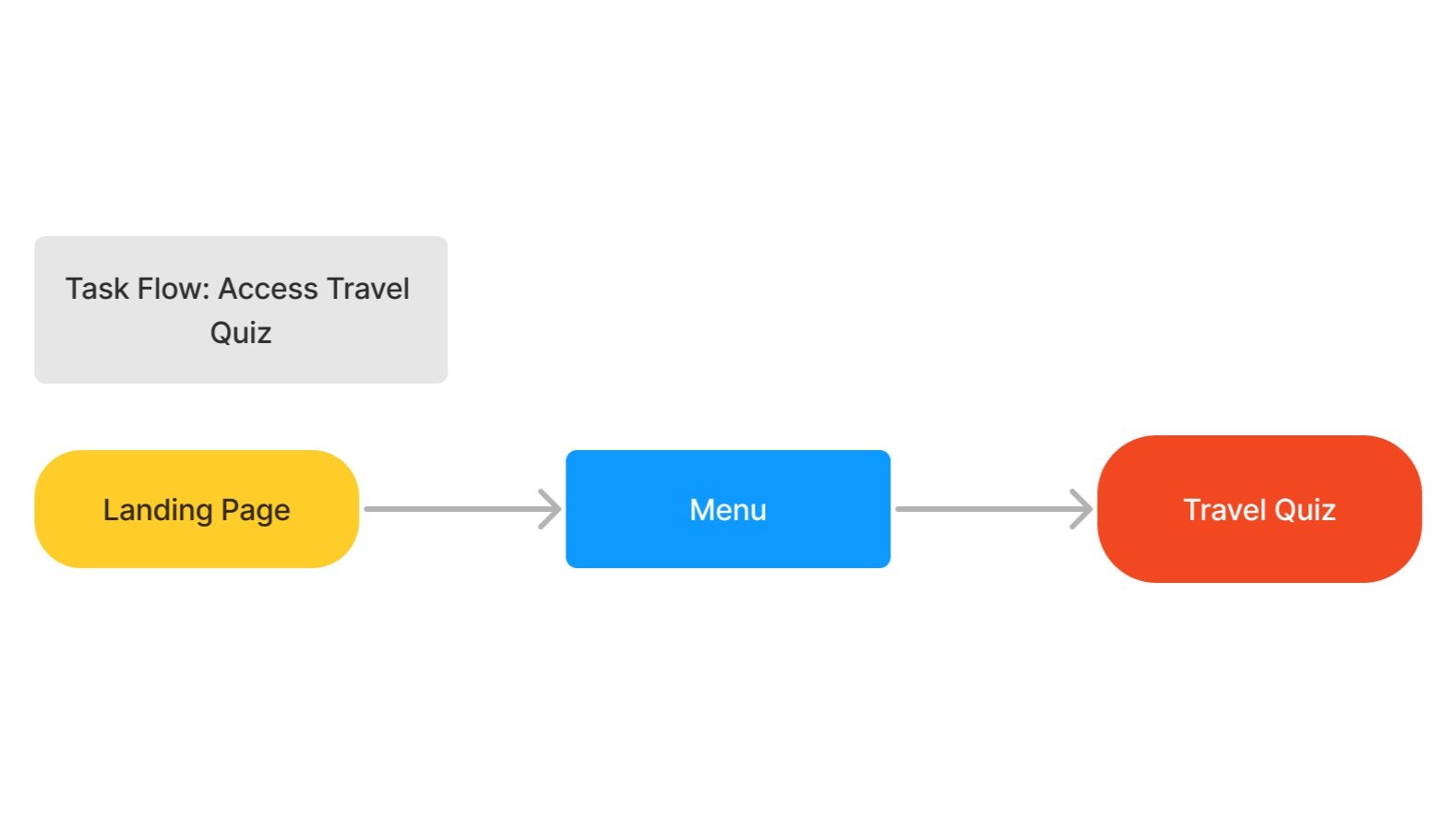
User & Task Flows
I took my user and flow tasks using the low fidelity wireframes to design mid and high fidelity wire frames.
Wireframes

Usability Testing & Iterations
The prototype was sent to participants to test 3 different tasks that met the solutions that would solve the problem at hand. From the prototype feedback, iterations were made and the final prototype was finalized.
At least two ways to access the quiz
Rate if there are sufficient questions/answers
Understand that luggage fits their needs/main features of the luggage
Tasks to be measured:
Results
5/5
User's felt luggage feautures were shown without multiple clicks
9/10
Ease of Use score
1 = lowest, 10 = highest
100%
Task Completion
Language - “Check all”. but nothing to check
Made the quiz so it was more specific to the chosen questions/answers
Iterations
Fixing action Language
Following the question in parenthesis, it asks the user to "check all that apply". However, the user is not "checking" anything.
Before:
The language was changed from "check all that apply" to "select all that apply". The language better aligns with the action the user is completing.
After:
2. Adaptable Quiz
This question ask what type of the luggage the user is looking for - in this case a carry on suitcase. Users are still given options that are not relevant to their previous answer of a carry on suitcase.
Before:
After:
Users are only given options to answer the current question based on the answer from the last question. They no longer have answers that are not relevant to them.
Final Prototype

Take Aways
With this project I was trying to make the quiz actually work with the Figma features, but I couldn't figure it out after searching and watching plenty of videos. That took up a lot of time and set me back on completing the project on time. Therefore, learning when to continue with an idea or just find the simpler route is a lesson I learned here.
I felt that the Away brand and website were sufficient and on brand. It was not something I felt needed to be reinvented and I wanted to focus on the quiz. However; this made me feel less organized with my Figma layers compared to other projects.
The quiz worked well as an added aspect and the way it was presented. There were plenty of ways to access the quiz without it popping up and disturbing a users flow on the site.


